Logo
A logo is the visual representation of a brand’s identity. It serves as the face of the brand, and is a crucial element in building brand recognition. It is important for it to be unique and memorable, as it will be displayed on all brand materials and products. Ours has a rich history, and we hope to continue carrying on that legacy for years to come.
Some may refer to it as the Pac-Man, Icon Ikan, or others. We prefer to call it eFo.

The Story Behind
eFo embodied our spirit of Tumbuh Bersama. It pushes us to keep getting better, growing and bigger. In short, it pushes us to evolve.
The circle
A circle is not just a symbol of enclosure, but also representscontinuity. Continuous growth, endless evolution.
The sish
Represents our beginnings as an Aquaculture company, and serves as a reminder to stay humble.
The shape
Our initial, stands for evolution itself. We encourage progress, we celebrate every milestone.
End to end
Represents the full scope of our business in providing end-to-end services across the entire fish and shrimp value chain - from upstream to downstream.
Logo Element
eFishery logo consists of two elements. Logomark and wordmark.Logomark
is a form of brand recognition point. One can easily recognize the shape and associate it to the brand.
Wordmark
is a distinct text-only typographic treatment of the name of a company, institution or product name used for branding.
Logo Varations
Our logo embodies the essence of versatility, as it will be utilized across a multitude of mediums. We ensure that it looks just as good on screen as it does on print.Brandmark
A symbol of high recognition, represents our identity and will be prominently featured where thewordmark is not needed, such as social media profile picture.

Horizontal
The most basic usage of our logo, is primarily used in situations where there is ample space to showcase our brand.
Horizontal logo
Horizontal logo with slogan
Vertical
Designed to capture attention in limited spaces, the brand and logo mark proportion have been cleverly adjusted to ensure maximum impact.
Vertical logo

Vertical logo with slogan
Logo Usage
We have two variations of our logo, one with a slogan and one without. It’s important to know when to use each for effective brand communication.“Different usage for different purposes”

Horizontal logo
Used for corporate purposes such as publications, press releases, TV spots, partnerships, etc.

Horizontal logo with slogan
Used for brand purposes such as brand campaigns, product campaigns, social media contents, in-apps, etc.
Logo Proportion
A logo must be versatile, while also adhering to precise measurements to avoid distortion and maintain visual integrity.Brandmark
Horizontal logo
Horizontal logo with slogan
Vertical logo
Vertical logo with slogan
Finding the right size
Like clothings, a too small logo is uncomfortable to look at and won’t be functional.“A logo needs to be always visible, recognizable and readable.”
Digital
Pixelation is prone to happen in digital screen. Therefore minimum standard is required.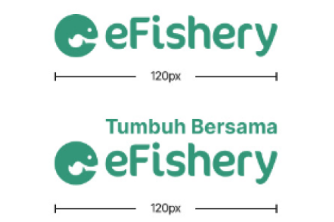
Horizontal
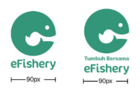
Vertical
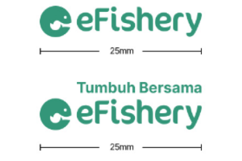
Horizontal
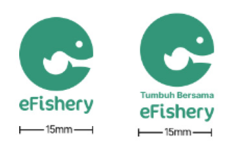
Vertical
Safe Area & Placement
Like humans, a logo requires a defined space to feel comfortable and visually appealing. A well-designed logo will be easy to see and read, and stand out enough to be easily recognizable.The safe space comes from the center of our logo
Horizontal
Vertical
For branded content always put our logo on either top right or center top of visual.
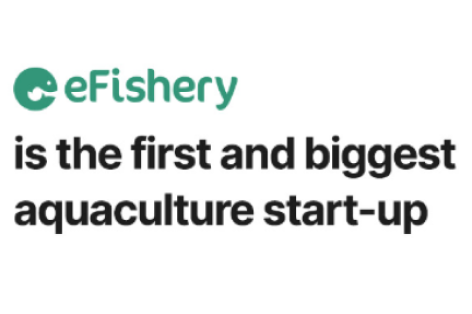
As a seamless part of a sentence
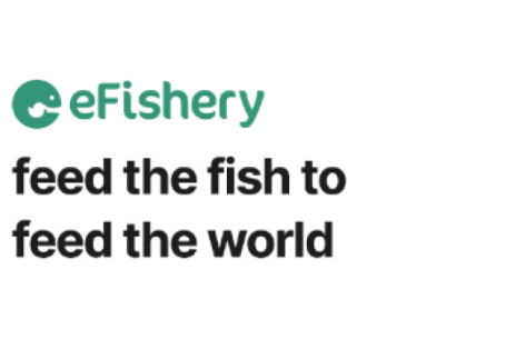
As a statement
Partnership and collaboration
Ways to pair our logo with partners and other brand logos.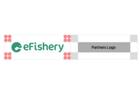
The logo must be placed out of safe area
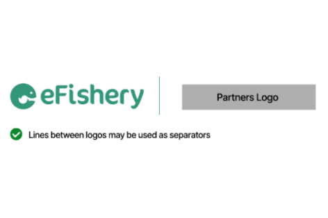
Lines between logos may be used as separators
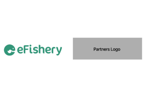
Patner logo shouldn’t be bigger than eFishery logo
Logo Do’s and Dont’s
Use the main colour version of the logo on white background
Do not use shadow on the logo
Use the main colour version of the logo on white background
Do not stretch and skew the logo
Use white version of the logo on dark background
Do not rotate the logo
Use white version of the logo on dark background
Do not use any other color on the logo
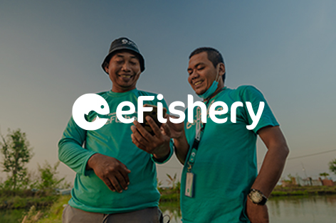
Use white version of the logo on dark background
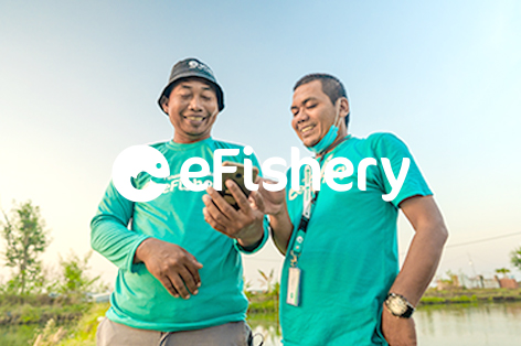
Do not use white logo on bright background

Use main color version of the logo on background with light colored image
Do not use random colours on the logo
Use the main colour version of the logo on white background
Do not use shadow on the logo
Use the main colour version of the logo on white background
Do not stretch and skew the logo

Use white version of the logo on dark background
Do not change the proportion

Use white version of the logo on dark background
Do not change the logo construction
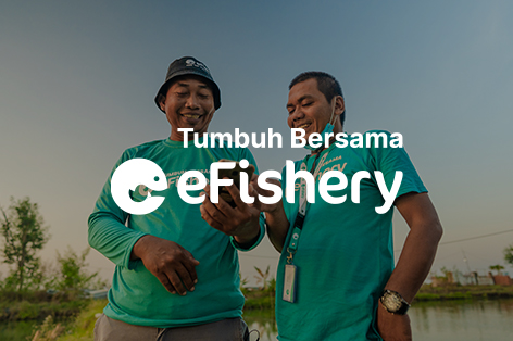
Use white version of the logo on background with image
Do not change the combination

Use main color version of the logo on background with light colored image
Do not change the logotype
Brand Architecture
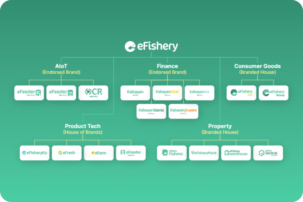
Brand architecture efishery