Brand Typography
Brand Typeface
Writing is a vessel for communication, so we want to make sure our message delivered correctly to the audiences. The right choice of typeface determine the comprehensibility of the message itself. Hence, we choose Inter as our main typeface. It’s simple, versatile and dignified. Matches well with our hero personality.
Inter
A Variable font family carefully crafted and designed for digital screens.
designed by: Rasmus Andersson
ABCDEFGHIJKLMNOPQRSTUVWXYZ
abcdefghijklmnopqrstuvwxyz
1234567890!@#$%^&*()
Secondary Typeface
Cocon used in our logo as the logotype. It has a very unique shape thus it has a really high brand recall. It is rounded and has pointy ends, reflects well with our nature as an aquaculture company, flexible in the process but still focused towards the end goal.
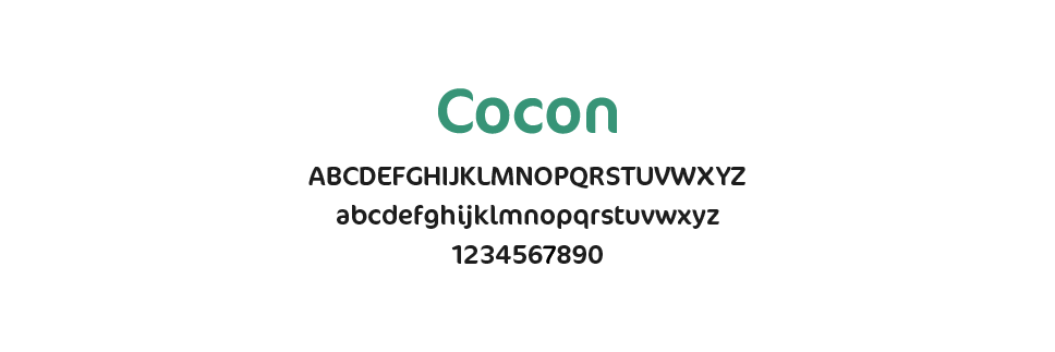
Due to it’s unique nature, this font has a very limited usage. It can’t be used on long titles, all caps title, or body text. But fret not, while it’s limited it’s still very impactful.
Typography Usage
Inter have a lot of font family. To keep the consistency of the brand across platform, we choose the most suitable font for each usage.
Headline needs to stands out, strong and catches attention. The thickest font allowed is bold.

Only use cocon when it’s a really short title, eFishery logotype or mentioning product name.

Sub-headline bears signifacance more than a body text, a summary, shall we say.
